How Marketers Can Measure Content Attribution With Tableau & Google Analytics

What is content attribution
The term “Attribution” in marketing is an analytical method that reveals which marketing channels contribute to conversions. It helps marketers determine the value of those specific touchpoints in the buyer’s journey.
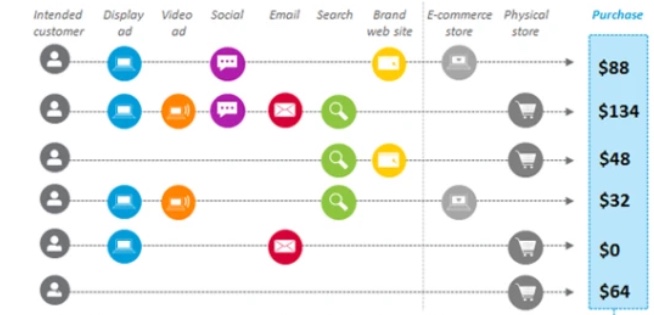
Here is a visual example of typical marketing attribution.
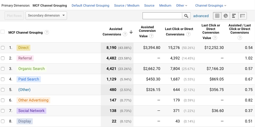
Here is an example from the Google Analytics report showing channel-group performance.
In content attribution, instead of tracking the source of channels that lead people to the website and converted, we’re looking for the contents that drove conversion.
Content attribution is an analysis method that examines the degree of conversion contribution.
Tracing the content that effectively leads to more conversions and the sequence in which the content is viewed should be important in digital marketing. So not only the degree of contribution to the conversion of each channel should matter, but it is also important to measure how much each content (page) on the site contributes to conversion.
So if you could identify the effective pages and content that leads to conversions over the less effective pages, then you could apply the insights to building your content strategy.
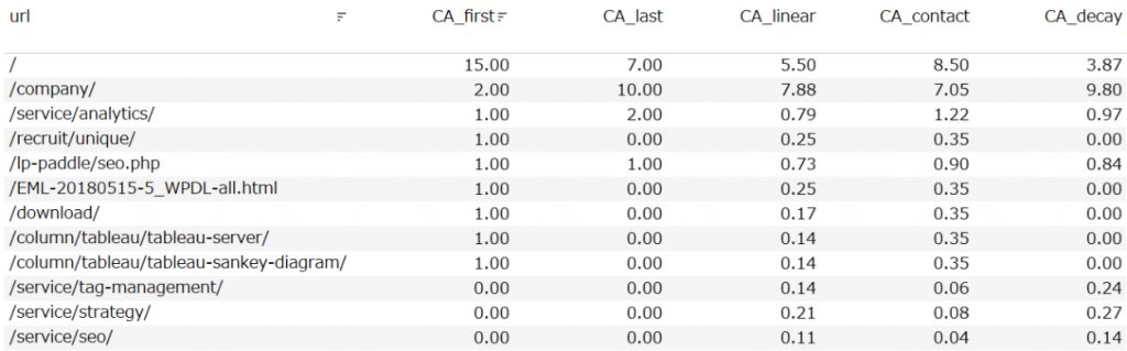
The data table below shows the contribution of each page on our website, where the contribution amount of 1 is attributed to each visited page. This content attribution value could be visualized by applying the attribution models.
Most marketers would wonder how you’d generate such data for reporting content attribution. No worries, we’ll share an approach using Google Analytics and Tableau. The good news is, this could be achieved with the free version of Google Analytics.
What we’ll introduce is using our own data, we’d like to answer “What are the pages that drove first-time visitors to come back to the website?”.
Why this matter to marketers
There are three reasons why content attribution matters to marketers.
1. It is an effective way to help marketers optimize their conversion rates.
When you understand what page attracts new visitors and engages them, and really drives them back to the site to convert, then you can focus your A/B testing (CRO) efforts on that particular touchpoints to boost conversions.
2. Gain insights into what content site visitors are engaged with prior to converting without limitations on the timeframe.
In most cases, users are not reaching the conversion point directly at their first visit, but rather, shoppers are visiting multiple pages and multiple times prior to conversion.
For example, a visitor would view the home page first, then go to blog pages, corporate overview page, and finally the product or service page.
A couple of days or weeks later, the site visitor may make a conversion after several sessions viewing multiple pages as mentioned above.
However, marketers either look at new visitors or return visitors in silos and ignore the fact that shoppers make multiple visits and view multiple pages prior to making the decision to buy.
3. Understand engaging content and how that differs from new visitors, first-time or repeat customers, lead generation, sales enablement, etc.
Attractive and performing content is different for new visitors and repeat customers. Knowing the difference allows a marketer to invest resources where it could be more effective.
It is common for the user’s first touch to be from a link seeded somewhere online that grabbed their attention. For those visitors who already know the brand, would likely to make the decision to buy if there is something more to the offer, compelling enough for a shopper to shop again.
For a marketer to understand what content helped made that transition from one segment to another is very valuable.
Content attribution basics: Visualizing webpages that drove repeat visits.
Among the many pages that exist on the website, there should be some that are more appealing to users that strongly evoked subsequent revisits, and on the other hand that did not motivate revisits.
In general attribution analysis, we show the contribution to conversions by channel, but in content attribution, we will output how much each page on the site contributed to each conversion.
Let’s take a look at an example using a simple “small data verification” method. This is a method which we’ll use to verify the data with a few lines of records allowing us to visually confirm the work.
If you do not do this, you cannot be sure that the calculated field you created is correct. After verifying that the small data is correct, we will visualize the actual large data.
Please see the image below. The original data Excel is shown on the left table within the image.
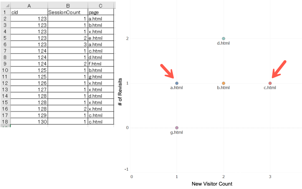
- Column A: Let’s consider the “cid” in column A as the user identifier.
- Column B: “Session Count” in row B refers to the number of sessions in Google Analytics, which means how many times users have visited the website.
- Column C: Page URL refers to the page on the websites associated user has visited.
Let’s take a closer look at the user cid 123 as an example. This user saw the page a.html, b.html, and x.html on her first visit, then we can see this user re-visited the page e.html again given that it has the session count 2. At this point, we’ll assume page a, b, and x encouraged new visitors to re-visit the website.
Now let’s take a look at the user cid 125. This person saw Page b.html and g.html, and have never revisit the website again. It seems this new visitors cid 125 were not engaged enough by page b and g to revisit the site again.
By customizing your Google Analytics tags and getting this type of data, you’ll be able to track on a page-by-page basis whether the first visitor’s visited page drove returning visit or not.
When you look at the scatter plot diagram, the X-axis represents the “New Visitor count by page” and Y-axis shows the “Returning Visitor count by page”.
For the page e.html, it wasn’t tracked as a page new visitors visited so it is not represented in the scatter plot.
For page a.html, user 123 has had a new visit on that page, and that same user has returned back to the website. Hence that is plotted on the (x,y) axis as (1,1).
Let’s take a look at another example. For page c.html, user 124, 129, and 130 have visited that page on their first session. However, only the user 124 has revisited the website after. Hence the data is plotted on (3, 1).
Using this small data set, we verified that the data were plotted in the right place as intended. We could confidently say that the calculations and visualizations are working correctly.
You can download the twbx file from Tableau Public. Please click the below link if you are interested in the detail of the calculated field.
Tableau Public:https://public.tableau.com/profile/kazkida#!/vizhome/_TableauPublic/NewVisitor?publish=yes
Using actual Google Analytics data and Tableau to measure content attribution
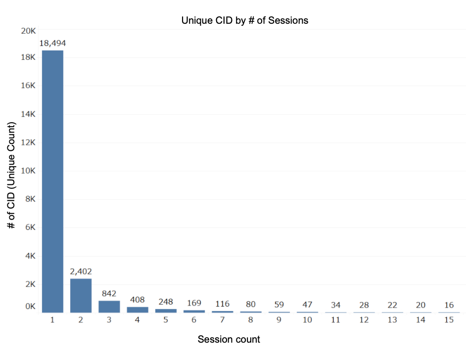
The following data is the traffic data from Principle’s website. The chart shows the number of users allocated by “session count”. The data indicates that the majority of the website visitors we get is one time visitors. Returning visitors or people with multiple sessions drops significantly. This result resembles the Poisson distribution, but this characteristic is pretty common for many websites.
This Principle’s website has already been customized with Google Analytics so that the data equivalent to Excel used in “Small Data Verification” could be acquired.
Then I created a scatter plot similar to what I did earlier with the “Small Data Verification”.
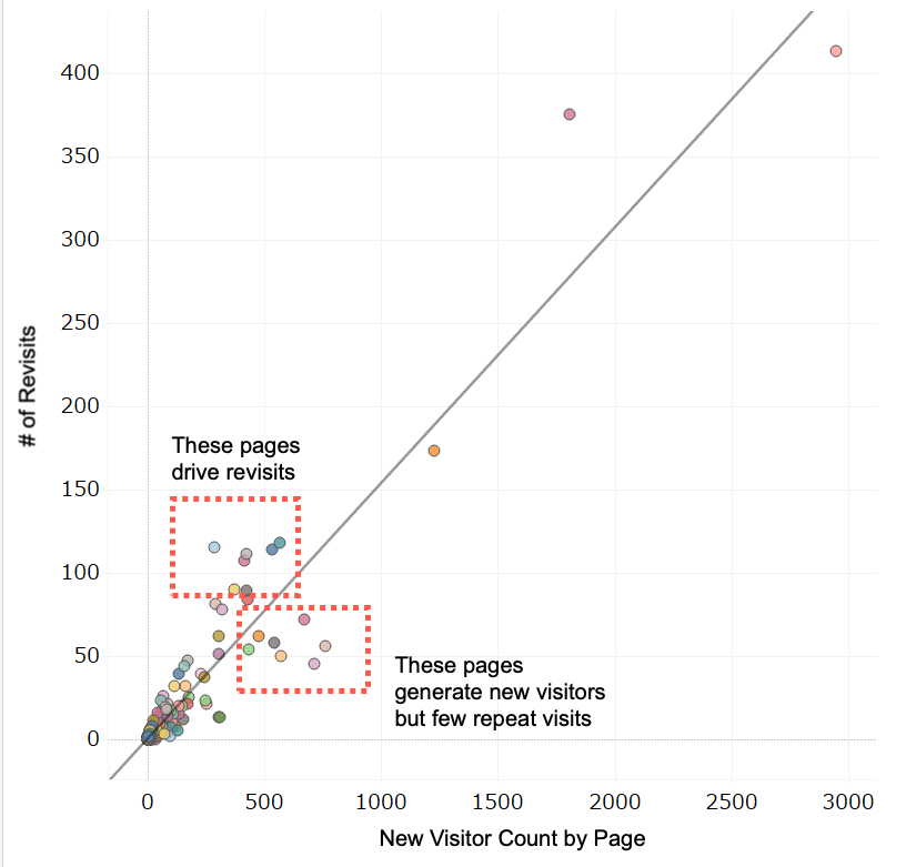
As expected, the results showed a correlation for a page that gets a high number of new visitors and will also get repeat visits. However, the pages represented towards the bottom right are the pages that tend to generate new visitors but few repeat visits. Conversely, the pages on the top left tend to generate more repeat visits.
The table below shows the top 10 pages with the highest revisit rates and the worst 10.
Let’s take a look.
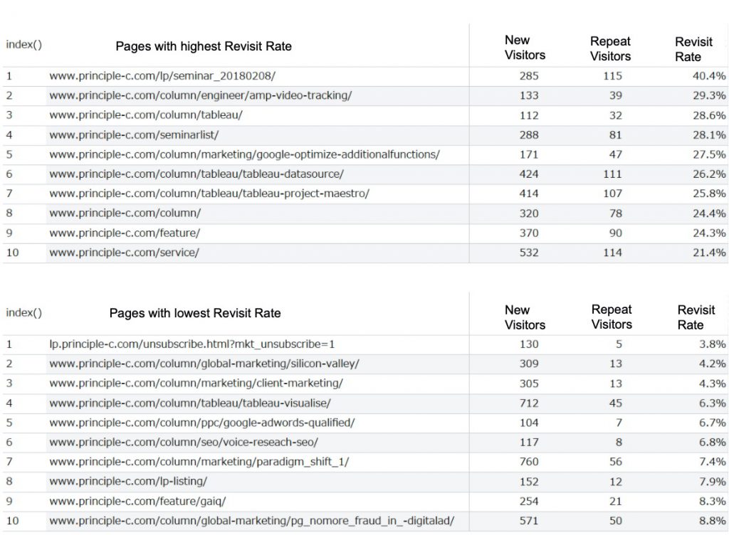
There is a relatively big gap in the revisit rates (3.8%~40.4%).
The page with the highest revisit retention rate is about a seminar. We’d assume that visitors come to the page because they want to check the time and place. If so, then sending out a frequent reminder to registrations would be a reasonable thing to do.
We also see that blog articles that are technical tend to have a high revisit rate.
The company intro, feature, and services pages had an unexpectedly high re-visiting rate. We’d like to hope that we did fairly well to convey the necessary message a corporate website would do.
We noticed some of the pages under /column/ showed up on the page with the worst revisit rates. Blog articles tend to capture one time visitors with a high bounce rate so it is hard to say if this is a bad thing or not. But if there are any blog article that drives high revisit rate, then there is something we could learn from, and apply that to future content strategy.
How you can applying content attribution
Just as we have different attribution models for multi-touch attribution, it would be interesting to apply the different models in your analysis to identify the next steps for your marketing strategy.
Here are some examples of different attribution models after segmenting on the users that converted.
First interaction: If you see a certain content skew towards driving new visitors, then analyzing what makes that content attract new visitors and eventually convert. If this page is a landing page for paid media then let’s test different copy, images, hook, etc.
Time Decay: The value of the conversion allotted to the pages touched in the conversion path will decay as pages are viewed. So the analysis will need to focus on how you can drive conversions with minimal pages or steps.
Linear: Equal amount of conversion value is allotted the pages touched by the user. So if you see any pages with low attribution value, then consider making enhancements to those pages.
As you can see, reviewing your content strategy using content attribution could provide some interesting insights into how your content is engaged in various parts of the customer journey.
The basics we introduced covered an example of how to assess web pages that drove returning visitors. However, marketers who are focused on improving conversion rates would need to take into account traffic volume, or pages that actually lead to sales (not revisits).
With content attribution, we believe it will specifically identify the strong and weak pages in the consumer’s conversion path.
Please feel free to reach out to us, we could help you set up Google Analytics and your data management platform to enable your attribution analysis.
Do you need to enable the right marketing data to grow your business?
Good data practice starts with good data collection. At Principle, we enable, integrate, and manage your marketing data. Click here to learn more about our agency services for:
- Data Management Consulting Service
- Data Visualization Services with Tableau and Data Studio
- Google Tag Management Service
- Marketing and Google Analytics Services

Co-Founder / Analytics Evangelist
Kaz is a Co-Founder of Principle and leads Principle’s search and analytics solution teams. Kaz has published books on Google Analytics and Tableau Data Visualization. He is an industry-recognized leader. Kaz retains certifications: Google Analytics Partner, Tableau Certified Professional.